About this website
1. Introduction
Why I Built This
I had a portfolio before, one of my first React projects. It was cool, with a built-in bot pretending to be me, but over time, I felt it was too generic. It looked like every other portfolio out there, and that's not who I am. I like to do things differently, to create something unusual. Isn't that already part of what makes a portfolio interesting?
I started looking for inspiration, browsing portfolios across different fields: software engineers, UI/UX designers, photographers, graphic artists. Many were visually stunning, but none felt like the kind of portfolio I wanted. They inspired me not in design, but in concept. I wanted my portfolio to feel like a real project, not just a showcase. A portfolio where people could interact, not just browse.
💡 Then, it hit me. GitHub
I love GitHub's minimalist yet effective design. It's built for developers, and let's be real: what developer hasn't used GitHub at least once? That's when I knew: I wanted my portfolio to feel like a GitHub clone. Not just in aesthetics, but in functionality: interactive, intuitive, and dev-friendly.
Key reasons I built this
- Showcase my work and writing: A portfolio's core purpose. But beyond projects, I've always wanted a personal blog to share thoughts and ideas.
- Create something dev-friendly (and beyond): Inspired by GitHub, but designed so that anyone can navigate it easily.
- Make it interactive: I didn't want visitors to just look at my site; I wanted them to use it. Features like ManuPilot, Discussion, and Dev Quiz make it engaging and unique, making this portfolio feel like a proper GitHub-like project (or at least in part).
- Improve my own skills: This project pushed me to learn new things, solve challenges, and refine my development workflow.
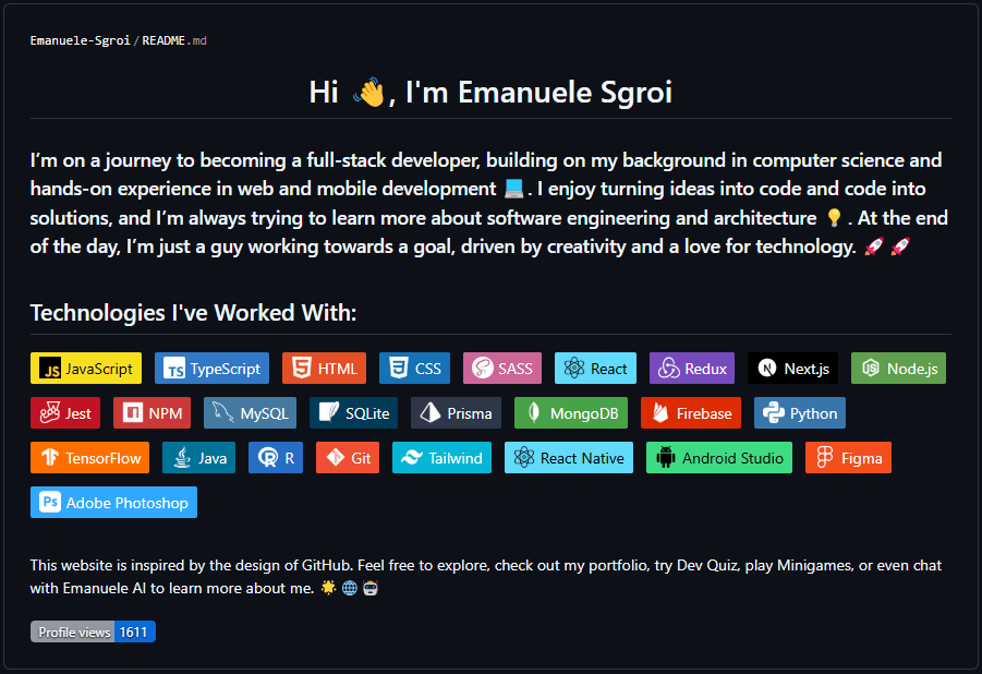
Technologies I Used
To bring this project to life, I used a combination of modern web technologies, libraries, and tools. Here's what I used to build it.
Don't worry, I'll go into more detail about each one in the next sections.
- Next.js
- CSS
- Tailwind CSS
- Prisma
- Supabase
- OpenAI
- Contentful CMS
- ShadCN
- GitHub
- Vercel
2. Design & UI
GitHub-Style Inspirations
As mentioned in the introduction, I wanted my portfolio to look and feel like GitHub, from the layout to the colours, fonts, and overall structure. Some might disagree, but I personally love GitHub's minimalistic design. Plus, using GitHub as a design inspiration makes sense for a portfolio aimed at developers, who {"("}hopefully{")"} might find it a cool idea.
While the layout is heavily inspired by GitHub, I still made my own modifications where needed. My site doesn't have all the features that the real GitHub does, but I replicated as many UI elements as possible {"("}buttons, links, tags, and so on{")"} to maintain a familiar experience.
Here's how different sections of my portfolio map to GitHub:
- Welcome Page → Mirrors a GitHub profile page.
- Portfolio Page → Inspired by the repositories page, but I added my own touch, like the option to switch between list view (GitHub-style) and grid view.
- Project Details Page → Partially inspired by a GitHub repository page, but with changes, like no file navigation and a different way of displaying images.
- Writings Page → A mix between GitHub Blog and GitHub Marketplace.
- Blog Posts → Mimic the GitHub Blog post layout.
- Dev Quiz → A unique feature not found on GitHub, but designed in a way that follows GitHub's UI style.
- Discussions → Closely resembles a GitHub Discussion thread.
- Contact Page → Doesn't copy a specific GitHub page but follows a similar layout to a profile page.
- ManuPilot → Both the ManuPilot page and quick chat interface are heavily inspired by GitHub Copilot, making it feel like a natural extension of the GitHub ecosystem.
- Navigation Menu, Profile Bar, and Other UI Elements → All mimic GitHub's UI, keeping the design consistent.
Extracting GitHub's UI Elements
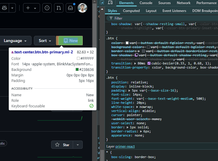
To make this portfolio feel like GitHub, I didn't just eyeball the design, instead I went straight to the source. Using the browser's Inspect Element tool, I extracted key UI details I was looking for.
This allowed me to get the same UI elements such as spacing, font sizes, colors, padding, border-radius, and more. GitHub's color palette follows a very simple and, as I've already mentioned, minimalistic pattern.
Example background colours - Dark mode
#0d1117
#010409
#151b23
#15191f
#212830
#15191f
#262c36
#57606a
Example background colours - Light mode
#ffffff
#fffeff
#f6f8fa
#dee1e5
#f6f8fa
#eaedf0
#eff2f5
#d1d5da80
Dark Mode
Unlike GitHub, which offers multiple light and dark themes, I decided to keep it simple with just one light theme and one dark theme. The goal was to stay true to GitHub's aesthetic while ensuring an easy-to-maintain color system.
- The theme switches automatically based on system preferences, but users can toggle it manually if they prefer.
- To stay as close as possible to GitHub's look, I extracted the colors directly using the browser inspector (as shown in the previous section).
- I paid extra attention to contrast and readability, making sure that text, buttons, and borders remain clear and accessible in both themes.
Responsiveness
This website is fully responsive across multiple devices. However, to enhance the mobile experience, I made the design closer to GitHub's mobile app when viewed on smaller screens. This was a deliberate choice because, well... I think it looks cool.
Of course, elements resize dynamically as the screen gets smaller, ensuring a smooth and consistent experience. Aside from the color adjustments that resemble GitHub's mobile app, the responsiveness follows the same principles as GitHub itself.
I personally believe that responsiveness is crucial in web development, and I made sure this portfolio adapts well across all devices.
3. Tech Stack
Next.js
I chose Next.js with the App Router because it offers the best mix of simplicity, performance, and flexibility. One of its biggest advantages is SEO benefits, who knows, maybe someone will stumble upon my portfolio through search engines. But beyond that, I picked Next.js mainly because of its Server-Side Rendering (SSR) and Client-Side Rendering (CSR) capabilities, which help make the website load faster and more efficiently.
Another major reason is API Routes. With Next.js, I don't need a separate backend framework like Express.js. Everything can be done directly within Next.js API routes, all in JavaScript.
Also, I just love how the App Router structures folders and files. It keeps things organized and makes development much smoother.
How I Use Next.js Features in This Portfolio
- Server-Side Fetching for Performance → I fetch data on the server-side for things like retrieving content from the CMS (Contentful) or handling OpenAI API requests for ManuPilot AI. This approach helps reduce client-side workload and ensures faster load times. see example.
- Next.js Image Optimization → I always use <Image /> instead of the regular <img /> tag. It automatically optimizes images by resizing, compressing, and serving them in modern formats for better performance.
My website relies primarily on Server-Side Rendering (SSR) and Client-Side Rendering (CSR). While I initially considered using Static Site Generation (SSG), I realized that most of my content is dynamic—pulling data from Contentful CMS, Supabase, and OpenAI's API. Because of this, I opted for SSR to ensure that visitors always see the latest data without requiring manual re-builds.
The downside of this approach is that it can make the site slightly slower compared to a fully static approach. I'll admit, this might not have been the most optimal choice due to my limited experience with Next.js at the time. It's something I plan to improve. In the future, I might implement Incremental Static Regeneration (ISR) to strike a better balance between performance and up-to-date content.
Tailwind CSS & Plain CSS
I chose Tailwind CSS because it's an incredibly efficient and flexible utility-first framework. It allows me to write less CSS and keeps my styling directly in the components, which means fewer files to manage. The built-in classes make it easy to maintain consistency across the website while speeding up development.
However, I didn't rely solely on Tailwind. I also used plain CSS for global styles, which I handled in globals.css. This was mainly for things like custom utility classes, animations, and overriding default styles where needed.
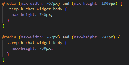
I did face some visual challenges, and I'll be honest, there are probably some sections where I could have done things better. In a few cases, I ran into layout issues, and to save time, I ended up fixing them with a lot of media queries in globals.css. While this worked, it also increased the file size significantly, which is something I plan to investigate and optimize in the future.
That said, my priority was to fix the bugs and make sure everything worked, even if some solutions weren't the most elegant. Continuous improvement is part of the journey, and I'll be refining this over time. 🚀
<div id="example" className="w-full h-screen absolute top-0 left-0" />
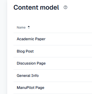
Contentful as a CMS
The CMS plays an important role in this project, allowing me to manage content without having to modify the code every time. Honestly, that's the main reason I chose to use a CMS for this portfolio: to keep things flexible and easy to update.
But why Contentful? Simply because it's fast and easy to use! Setting up content types is incredibly intuitive, and the implementation process is straightforward. Within minutes, you can structure your data exactly how you need it.
While I didn't use Contentful for everything in this project, most of the content that changes frequently comes from the CMS. This keeps the site dynamic while reducing the need for manual updates in the codebase.
Prisma & Supabase
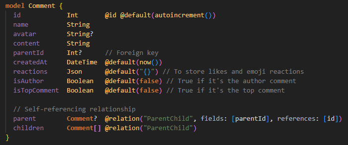
Prisma and Supabase were used exclusively for the Discussion feature of my portfolio. At the time, I was studying these technologies and wanted to gain hands-on experience by implementing them in a real project. Since I had never used Prisma and Supabase before, this was a great opportunity to experiment.
Looking back, I might not have chosen Supabase for such a small feature, but it was a valuable learning experience. If I expand the project in the future, I already have the foundation for handling database-driven interactions.
AI Integration
One of the standout features of this portfolio is ManuPilot, an AI-powered assistant designed to function like GitHub Copilot. I integrated OpenAI's API to create a chatbot that can answer questions, assist with coding, and interact dynamically with users. This was a challenging but exciting implementation, as it required handling streaming responses, API rate limits, and token management.
The AI works by sending user messages to a server-side API route that interacts with OpenAI's GPT-4 model. The API processes each request and returns a response, which is streamed in real time to create a smooth user experience. To prevent exceeding OpenAI's token limit, I implemented a summarization feature that condenses conversations when they get too long.
The main challenge was efficiently handling real-time responses. Instead of waiting for the entire response to generate before displaying it, I used streaming, which allows text to appear word by word, just like ChatGPT's interface. This makes the experience feel much more natural and responsive.
UI Frameworks
To keep the UI consistent with GitHub's design, I used ShadCN and React Icons extensively throughout the project. These two libraries closely align with GitHub's aesthetic, making them the perfect choice for this portfolio.
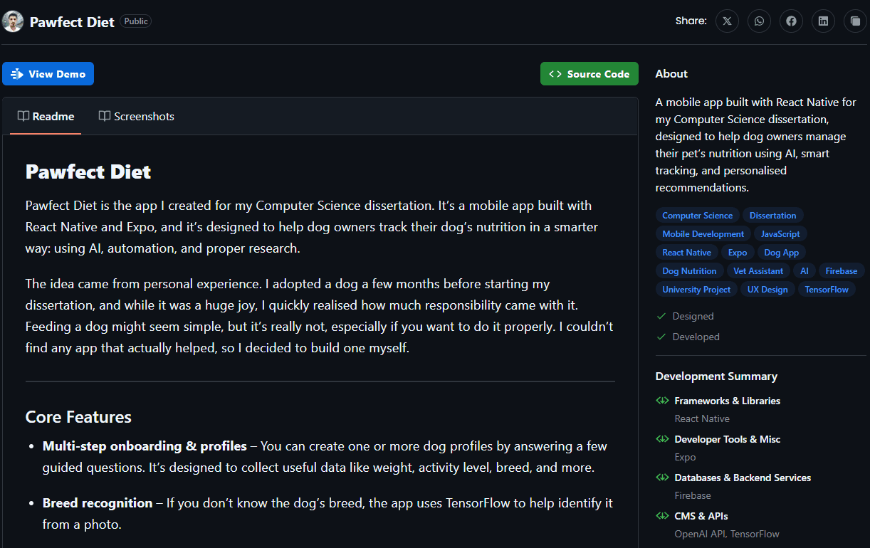
4. Features Breakdown
Welcome
The Welcome Page serves as the homepage of this website and, as mentioned before, it is heavily inspired by the design of GitHub's profile page. It is divided into four key sections: the Profile Bar, README, Pinned Tabs, and the Contribution Chart. The Profile Bar is also present on other pages, keeping the layout consistent.
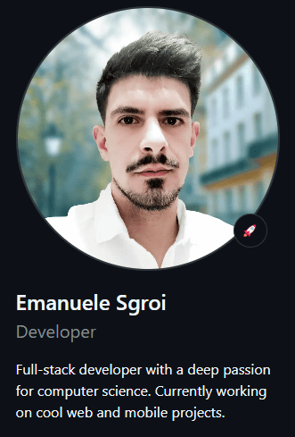
Profile Bar
The Profile Bar closely aligns with GitHub's, minus features like followers and following counts. It includes my photo, name, profession, a short about me, and social links, providing a quick overview of who I am.
README
The README acts as an About Me section, which is common in portfolios. It introduces me, my background, and showcases my skills. Just like how GitHub profiles often include a README for self-introduction.
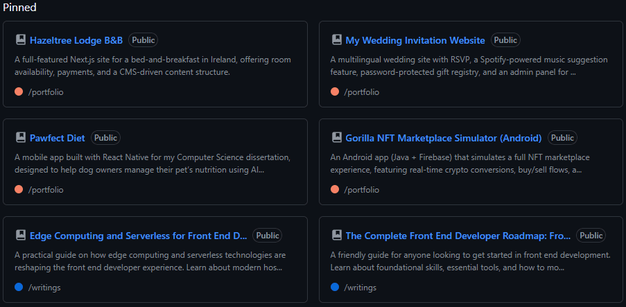
Pinned Tabs
The Pinned Tabs provide quick access to projects and other important sections. This feature is directly inspired by GitHub, where many profiles have pinned repositories for easy access to highlighted work.
Contribution Chart
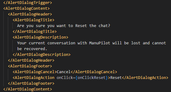
What GitHub profile doesn't have a Contribution Chart? I think this is one of the coolest parts of the Welcome Page. However, unlike GitHub's, my contribution chart isn't based on actual commits. Instead, it's an interactive feature where users can write something, which is then mapped into the grid.
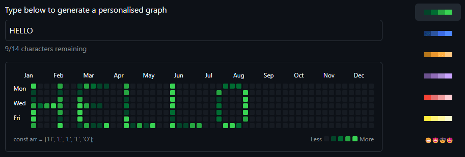
Users can also change the style, and one of the styles (which I personally find really cool) replaces the blocks with emojis instead.
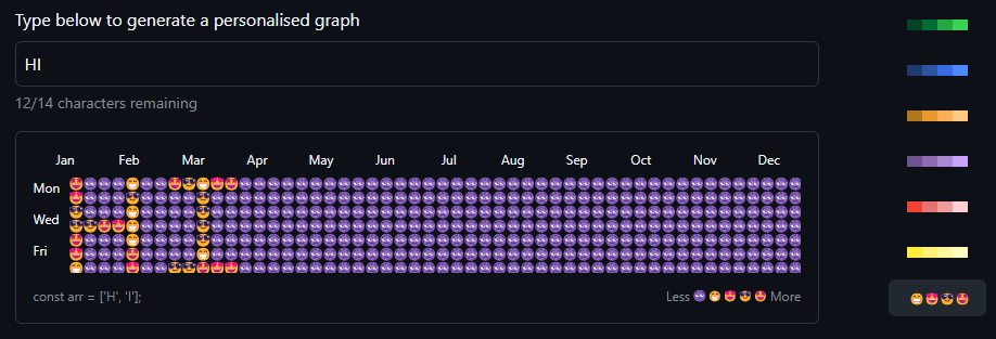
Creating this feature required a bit of manual work, as I had to map each letter in JavaScript to display the correct placement on the chart.
See examplePortfolio
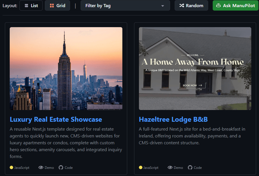
The Portfolio Page is inspired by GitHub's repositories page. This is where I showcase my projects. While the design closely resembles GitHub's, there are clear differences, as I couldn't fully replicate it due to the lack of certain features that GitHub has. For example, the buttons and filtering at the top are placed differently, and their functionality has been adapted for a portfolio setting.
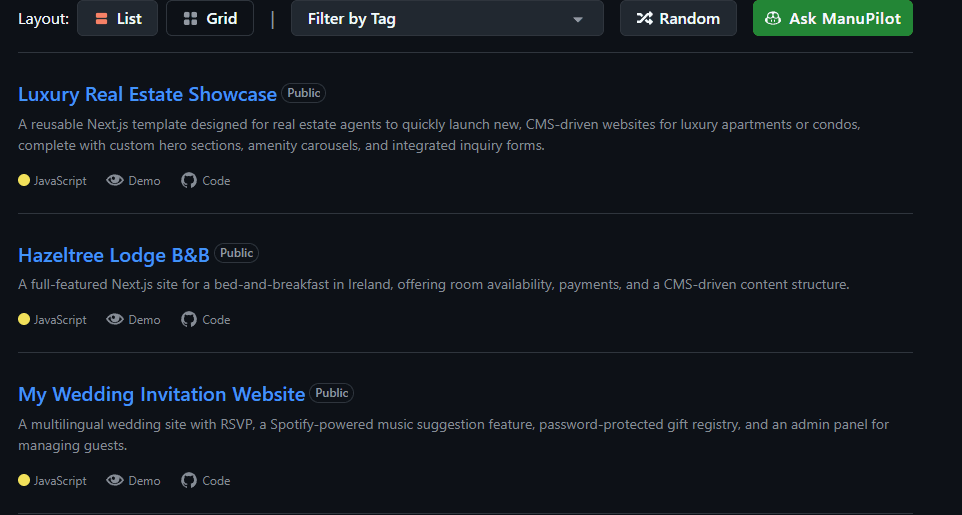
Users can switch between views, going from the classic GitHub-style repository list view to a grid view. This is something I intentionally redesigned. While it still maintains the GitHub aesthetic, it doesn't fully copy the repositories page, offering a more visual way to browse projects.
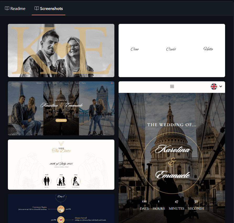
Project Details
When opening a project, the layout mimics how GitHub displays repositories, with some modifications. For instance, I didn't implement file/folder navigation like GitHub does, as I felt it was unnecessary for a portfolio. However, I still included a README section and a sidebar that displays project information, such as the technologies and languages used, just like on GitHub.
Another difference is how I handle project screenshots. Instead of embedding images within the README itself, I created a dedicated tab for project images, keeping them separate from the main content.
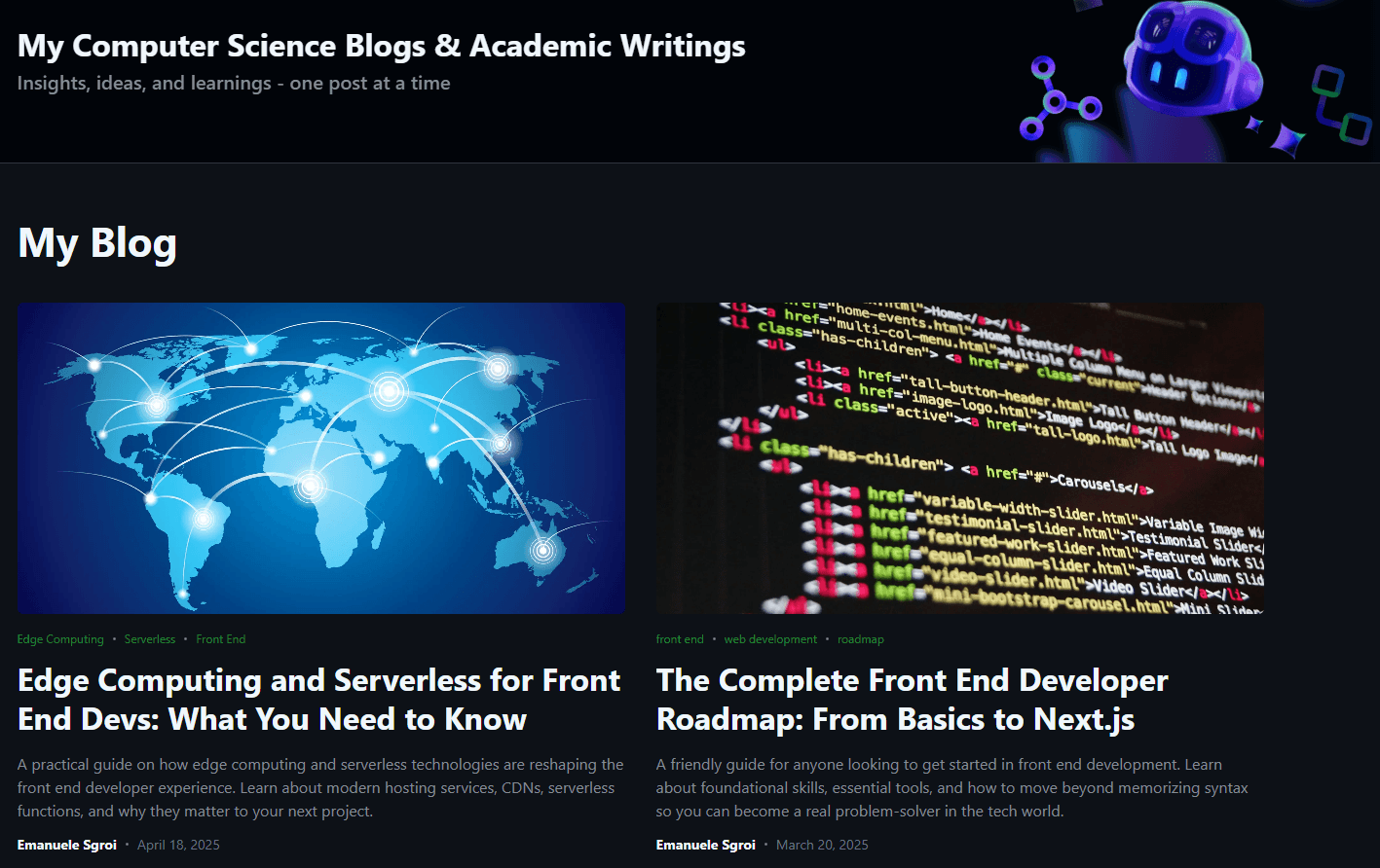
Writings
The Writings Page is where I share my technical content, and it is divided into two sections: Blog and Academic Writings.
The Blog is where I write about development and computer science topics. I enjoy sharing insights, technical deep dives, and best practices.
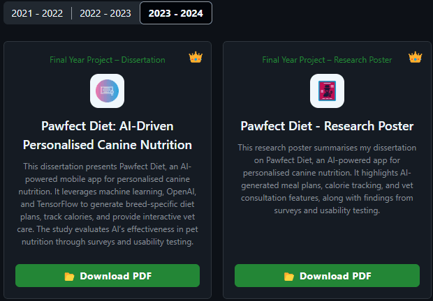
The Academic Writings section contains my university papers from 2021 to 2024. These papers were a significant part of my academic journey, and since many people asked for them, I made them available for download.
Blog Post
The individual Blog Post pages are heavily inspired by GitHub Blog Posts, featuring a clean and minimal layout with metadata like publish date, tags, and reading time.
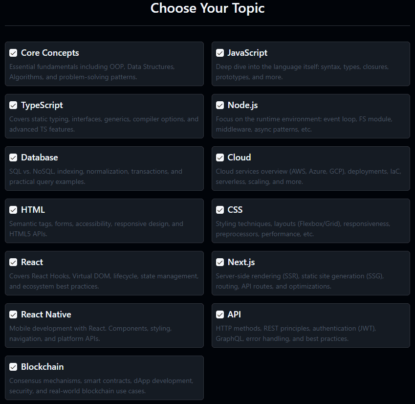
Dev-Quiz
The Dev Quiz is a cool interactive feature of this website, created with the goal of practicing for technical interviews. Personally, I find quizzes and flashcard-style games extremely useful for remembering difficult topics, so I built this hoping others would benefit from it as well.
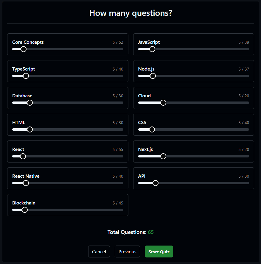
The quiz covers multiple topics, allowing users to choose which category they want to be tested on.
Users can also select the number of questions, with each one being randomly selected from the available pool.
The quiz works like any other multiple-choice test: it provides immediate feedback on whether the selected answer is correct or incorrect, along with an explanation.
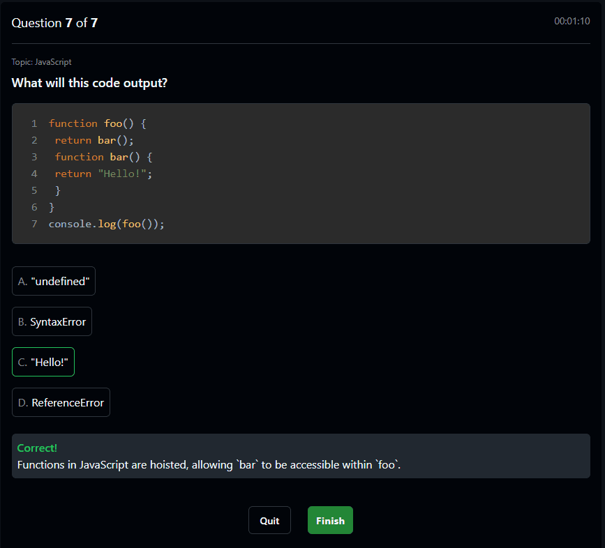
At the end of the quiz, users receive their results, showing their score and the time taken to complete the quiz. The score is color-coded: red for low scores, yellow for medium scores, and green for high scores.
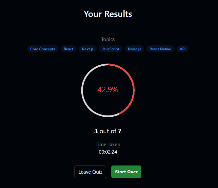
Unlike other features, the quiz data is not managed via the CMS. Instead, all questions are stored in JavaScript objects inside an array, grouped in a utility file for easy updates. This makes it much simpler to modify and expand over time.
See exampleDiscussions
The Discussions page is designed to mimic GitHub Discussions, which I believe is one of the coolest features of GitHub. The main purpose of this page is to let users leave comments if they want to. Whether it's something like "Hey, cool portfolio!" or "Maybe you should quit development..." (who knows?).
But beyond just leaving comments, this page offers other interactive features! Users can reply to other comments and even react with a like or emojis. Just like on GitHub!
One of the details to consider is the input field, which looks and functions almost identically to GitHub's, including Markdown support. However, I added a small twist: the user's profile picture is randomly generated based on their username using the DiceBear avatar API. Users can also customize their avatar style.
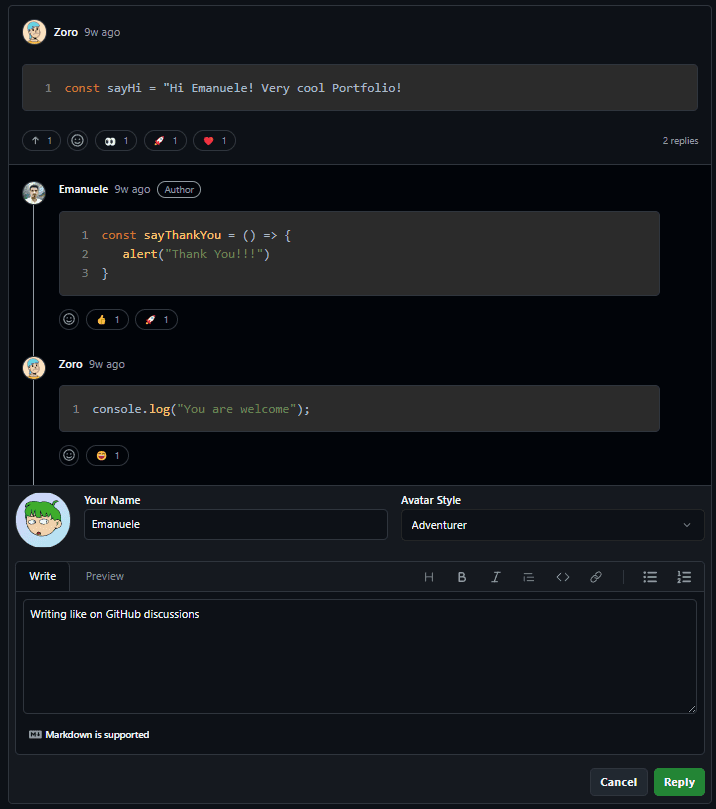
As mentioned earlier, this feature was built using Prisma schemas and Supabase, which I had never worked with before this project—making it a great learning experience.
If you think this is a cool feature, drop a comment!
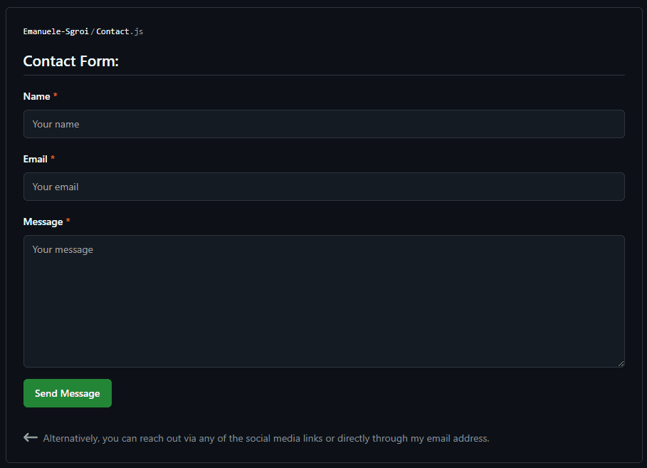
Contacts
Honestly, there's not much to say about this page. It's a contact form. Wow, what a surprise!
I included this so that if you ever feel like reaching out, you can easily do so through the form. It's a simple contact form built using EmailJS, which I've used many times before because it perfectly fits my needs.
Manupilot AI
A cool feature of GitHub is Copilot, so I really wanted to replicate that idea— and that's how ManuPilot was born.
Of course, this is just another AI chatbot, but it adds a nice touch to my portfolio since it's specifically instructed to provide information about me, aside from being a general AI assistant.
Powered by OpenAI's GPT-4, ManuPilot is available in two ways:
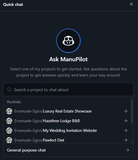
- Quick Chat: A chat that opens in the bottom-right corner of the website, allowing users to ask quick questions.
- ManuPilot Page: A dedicated page where users can interact with the AI in a more immersive way.
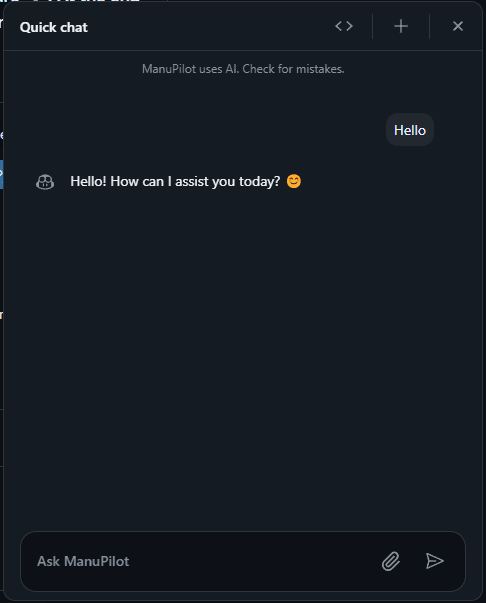
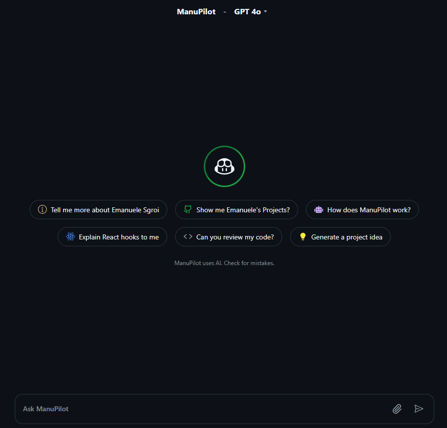
Both chats offer a GitHub Copilot-style experience. Currently, the quick chat also allows users to browse projects and talk about them in detail. I plan to bring this feature to the full ManuPilot page in the future, but even now, the AI is instructed to discuss my projects.
In both chats, users can upload code or text files for AI analysis.
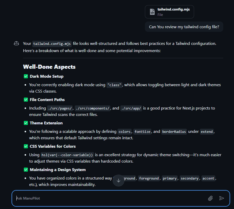
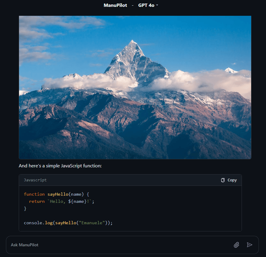
The conversation layout closely follows GitHub Copilot's chat UI. AI responses are properly formatted, with Markdown converted into readable text. The AI can also generate code and return images directly on the screen.
Use this AI with caution and stay tuned. This feature is still evolving and will be improved over time!
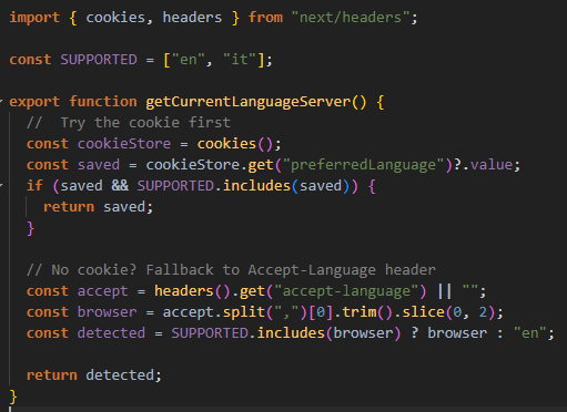
Multilanguage Support
The website supports both English and Italian, with seamless switching between the two languages. The default language is detected based on the user's browser settings, but users can manually change it at any time from the navigation bar or sidebar.
When switching language, both static translations (UI elements) and dynamic CMS content are updated simultaneously for a consistent experience.
This was achieved without using heavy i18n libraries. Instead, a lightweight custom Language Context was implemented, alongside locale-specific queries to Contentful.
Key points:
- English (en) and Italian (it) are supported.
- Default based on browser detection (fallback to English).
- Manual switch via buttons.
- Full Contentful integration for multilingual fields.
- Automatic persistence using cookies and localStorage.
Example:
5. Deployment & Future Plans
Hosting & CI/CD
To deploy my website, I chose Vercel. Since Next.js is built by Vercel, it made perfect sense. It provides a seamless deployment experience with automatic optimizations and fast global edge functions. Plus, it takes care of server-side rendering (SSR) and static optimizations without me having to worry about the infrastructure.
The project is hosted directly from GitHub, meaning every time I push changes to the main branch, Vercel automatically builds and deploys the latest version of the site. This makes deployment effortless, and I don't have to manually upload files or restart servers.
In terms of Continuous Integration / Continuous Deployment (CI/CD), everything runs smoothly with Vercel's automated pipelines. Every commit triggers a new build, and I can preview changes before merging them. If something breaks, I can easily roll back to a previous deployment with a single click.
Overall, Vercel makes my life easier by handling performance optimizations, caching, and CDN distribution automatically. If you're using Next.js, and also, for projects like this one IT'S FREE.
What's Next?
Well, as I mentioned before, there are things that need improvement. So if someone asks me "What's next?", my first answer would be that I need to refine what I've already built. There are parts of the project where the code could be optimized, and that's a priority before adding anything new.
Then, there are features that I will continue tweaking over time, making them even closer to GitHub's experience. Some sections are already well done, but others still have room for improvement.
I've also considered adding extra features, but at the end of the day, this is just a portfolio. It's already packed with interactive elements. Some friends suggested adding minigames, but I'm still undecided on that.
One thing that's certain is that I will actively maintain this site. Future plans include:
- Adding new projects as I build them.
- Keeping the blog updated, because having an empty blog makes no sense.
- Improving ManuPilot with more features and updates.
- Expanding the Dev Quiz as technologies evolve.
So, the future of this site is all about growth and updates. Some might see that as extra work, but to me, it's a great achievement. I've built a personal site that I actually need to take care of. That means it's not just a static portfolio, but an evolving project.
Thank You
If you've made it this far, thank you for taking the time to read about this website. I hope you found it interesting, and maybe even picked up some ideas along the way! This portfolio was a fun challenge, and I'll continue improving it over time.